What's new

Cubase 13 released! Now available for purchase

The local undo in the key editor feature that vanished between Cubase 10 and 10.5....any insight as to why this was removed and if it has a realistic chance of returning?
I asked one of the Cubase developers about this, and I want to stress that our developers do not set priorities on their own: priorities are set in collaboration between our product managers, product planners, and developers. So he isn't able to say what kind of priority this issue will be given.

However, he was able to give me some background on the situation. Local undo in the Key Editor was a cause of many undo-related crashes, and during the Cubase 10.5 cycle the decision was taken to focus on stability at the expense of this functionality. No decision has yet been made about whether or when this feature might return, but the team is aware that a number of users are missing it, and will discuss what might be required to solve the underlying problems with undo that would allow them to consider bringing it back in a future version.
 
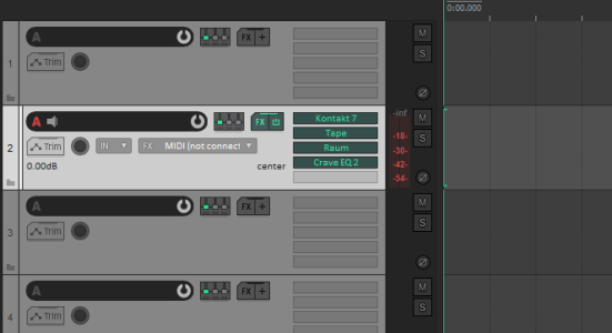
Also FOR THE LOVE OF ALL THAT'S HOLY why are there STILL no simple volume and pan controls on every track in the Project Window???? Literally EVERY OTHER DAW has this, makes so much more sense than having to click then go somewhere else to adjust these simple things that you adjust hundreds of times every day.
I'd kill for easier pre-gain access for sure. I hate going into the mixer and effects windows while I'm setting up tracks just for that one knob/slider. Sigh.
 
Not sure about the GUI and I certainly think C12 had a better colour scheme. Far too "fifty shades of grey" as someone else has aptly put it. I'm old enough to remember when 2D was considered to be "old fashioned" and a 3D appearance was considered modern. I guess we're going full circle on that aspect of GUI design.

The best solution would be, of course, the ability to select between a few different colour schemes but I doubt that's on Steinberg's to do list.
 
By adding the right things to the inspector by right clicking, you can get it to look quite a bit like the channel pane:

1698953480505.png

Obviously I don't need two faders for the same channel right next to each other so that's kinda silly, but it almost makes me wonder why these were implemented as different things like this. Like wouldn't it make sense to have these "channel" and "inspector" tabs both be like canvases where you could name them (or add your own) where could add the same list of items to either? I guess the problem there would be that some of these options wouldn't make sense in the mixer, and the channel tab is supposed to show the same things you would find in the main mixer.
I use another mixer instance just to have two mixer channels on left side of the inspector- one is always selected that I am working on. So channel tab does not makes any sense to me at least for Cubase pro users since one can have multiple mixers and those can be arranged as needed and can be saved as workspace. I am not sure if flat GUI is making CPU load less than before for same project. And yes font sizes - what a mess is created.
 
So no FOMO freebie plugins this time, (like they did with C12), so can safely wait until next year's sale... Nothing in this, that makes much of a difference to my lowly tunes....

Q) Have they implemented multi touch yet? My writing partner said that would be the only reason for him to upgrade today. He uses a monitor as a mixing console.
 
Pro - The tabs in the inspector stay open when selecting another one (I reported that bug nearly ten years ago).

Con - Still no support for pinch/zoom trackpad gestures, all the other DAWs have had that for years.
 
Not sure about the GUI and I certainly think C12 had a better colour scheme. Far too "fifty shades of grey" as someone else has aptly put it. I'm old enough to remember when 2D was considered to be "old fashioned" and a 3D appearance was considered modern. I guess we're going full circle on that aspect of GUI design.

The best solution would be, of course, the ability to select between a few different colour schemes but I doubt that's on Steinberg's to do list.
C13 GUI is a downgrade compare C12. There must be reasons but providing option to go back to C12GUI would be good.
 
I like most of the improvements though no need for the new plugins which I guess to justify the upgrade price.

I am no programmer but it puzzles me to still not have the simple functions like

Reset Recent Files List
Trackpad Pinch Zoom In and Out
.bak files in a separate folder
m4a import

I like range tool in key editor a lot but would have preferred it to have the ability to choose only selected notes like Live, plus there is still no stretch for notes but the tool is there in the key editor which is weird.
 
I think I might be the outlier here but I actually really love the new UI and channel tab! Feels a lot more modern to me, and I like how the channel tab feels more streamlined than the inspector which I'm now going to keep hidden most of the time. I use notepad and track versions every now and again, but I access my strip, inserts, and sends hundreds of times a day, so for someone like me this looks a lot better and easier to navigate. When I need the inspector or visibility tab it's just one key command away.
Count me as a second outlier, I absolutely love the spirit of the update helping me to feel supported in my work, making my tool sharper and more efficient!
 
For those who have upgraded, do the expression maps assigned on a track are saved correctly when using a track preset?

I had issues with Babylon Waves' expression maps for CSS for example in Cubase12: you assign then properly to V1, V2, Va and Cellos, then save the 4 of them as a track multipreset, but when reloading I can see that V1 expression maps is assigned to V1, V2 and Va...

What a mess!!

Hope it is resolved now (?)
 
Not sure about the GUI and I certainly think C12 had a better colour scheme. Far too "fifty shades of grey" as someone else has aptly put it. I'm old enough to remember when 2D was considered to be "old fashioned" and a 3D appearance was considered modern. I guess we're going full circle on that aspect of GUI design.

The best solution would be, of course, the ability to select between a few different colour schemes but I doubt that's on Steinberg's to do list.
100% this, give us a choice, please
 
Also FOR THE LOVE OF ALL THAT'S HOLY why are there STILL no simple volume and pan controls on every track in the Project Window???? Literally EVERY OTHER DAW has this, makes so much more sense than having to click then go somewhere else to adjust these simple things that you adjust hundreds of times every day.
A work around at least for volume for me is to open an automation lane. You can adjust the volume from there like you would with the fader.
But you have an additional lane to the audio track which is not optimal of course.
With every new version I look at the track settings if there is an option to have a volume right in the track as you have with group tracks. This should definitely be implemented imo.
 
Please tell me this is something I'm doing wrong or there's a hidden setting somewhere...

Create a new instrument track. Then add 7 new midi tracks below it. In C12 and earlier these would auto-increment starting channel 2 to channel 8 and set to the same midi destination.

Now there is a good looking new box with various options, which looks like you can set the start channel. Nice! But... not nice. It no longer auto increments, it just creates 7 new midi tracks with the exact same channel.

Please tell me I'm doing something wrong...
 
because one of the things we are thinking about is how to bring the capabilities of Dorico and Cubase in this area closer together in future – though we have not collectively determined that this is definitely what we plan to do.
I bet if this would be your priority you would really turn into a game changer. A true integration of Dorico and CB would be a dream for every serious composer. But maybe there are not enough serious composers around to make it into what you plan to do....?
 
I’m struggling to pull the trigger on purchasing this update which I have anticipated as eagerly as anyone. Historically I haven't given it a second thought. Not really sure what my problem is this time around lol. Everyone has their priorities for sure - in my case I was really hoping for improvements that would enable a workflow other than disabled tracks. Specifically through templates (that retain their routing), and/or track archives (that are integrated with the browser), and/or track folders (stacks). None of which appear to be in this update. So ya…I’m kinda waffling and thinking for my needs at this time Logic or Studio One may be more aligned to how I want to work creatively.
 
Finally! I got an email that C13 is available. I thought that Steinberg had forgotten about me ;)

Did anyone have a chance to try those new plugins? I wonder if EQs can replace the RuleTec plugin. So far what I heard from Dom's video didn't convince me.
VoxComp seems to be really nice from the videos. Black comp too, although it would be nice to hear more examples.

It's really annoying that we can't do the trial now. Oh, Steinberg, you always must 'think different' ;)
 
@Daniel S.

I see you've been very responsive to our questions, which is awesome as you're not even officialy working on Cubase. I was wondering if you know if a feature i've always wanted has ever been talked about internally: The ability to edit CC data of multiple selected parts.

I really thought this feature was added when i heard about "multipart editing" but still the only thing you can "multipart edit" are the notes themself.

When working on a full orchestral track and i have to for example extend the last cresciendo a bar, i can easily select all instrument parts and extend the notes one bar. But when i then want to edit the modulation and or expression i have to edit all the parts one by one (or copy paste them)
 
Top Bottom