What's new

Cubase 13 released! Now available for purchase

Please tell me this is something I'm doing wrong or there's a hidden setting somewhere...

Create a new instrument track. Then add 7 new midi tracks below it. In C12 and earlier these would auto-increment starting channel 2 to channel 8 and set to the same midi destination.

Now there is a good looking new box with various options, which looks like you can set the start channel. Nice! But... not nice. It no longer auto increments, it just creates 7 new midi tracks with the exact same channel.

Please tell me I'm doing something wrong...
It's a known issue apparently, will be fixed I think in the next maintenance update.

A workaround (and a cute feature I've never used actually) is to create 1 midi track, then double click blank space under it - that creates a channel incremented new track. Fine for new projects, but clumsy for adding tracks to existing ones where there is only blank space at the bottom.
 
I've little positive to say thus far about C13, and I may yet eat my words but.... drum roll... it looks like multi outs on disabled tracks are working properly again.

Can it be true?

I'll try and break it in the coming days. If it does work, whatever my (many) irritations with C13 I'm sticking with it.
 
I like some of the GUI redesign, but the look of selected tracks (especially when the mouse hovers over it) is incredibly ugly. Improvements to multi-part editing are nice, but not being able to edit velocities and CC's for multiple tracks is really unfortunate (really expected to finally see this, especially since even Dorico can do this now).

I also hoped that with the new window management, plugin windows would finally stop opening up all over the place on my 4 monitor setup, but that also hasn't changed.

All in all a mostly disappointing update I find. Also really sparse overall, especially considering that they almost had more than half a year of extra time for development.
 
I'm back at having no idea why my control surfaces don't work. The Midi Remote Manager in C12 was messing everything up, so I never used it. Still not gonna use it in C13, but this time it feels like it "knows better".

I got CC121 to work, by removing it from the midi remote manager, then changing inputs in the Studio Setup to none, then back to CC121. I have to do it now every time I open Cubase otherwise, it will not work. It is also now CC121-1 instead of just CC121 for some reason.

I tried opening Cubase with no preferences. This made CC121 work, but Platform M+ had only first fader working, lol. Anyone got all either working reliably?

- Piotr
 
It's still in a window that I have to click for.
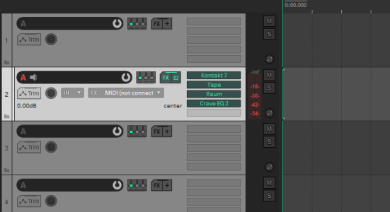
Meanwhile in Reaper, I have every plugin right there in the main view:
Reaper.png
You have the same thing now in the new channel view. All your plugins, right there in view. You could already do that in the inspector by having the inserts pane open (you could always ''lock'' it so it would stay open at all times).

So I have no idea what you're trying to get at, but as far as I know, Cubase had this years before Reaper every implemented it.

I like Reaper, but I don't like misinformation.
This looks more like Pro Tools, where you can see the inserts on all tracks, not just the selected one.

I like it Pro Tools when I'm mixing projects, but actually prefer not seeing them in Cubase while I'm writing.
 
I was wondering if you know if a feature i've always wanted has ever been talked about internally: The ability to edit CC data of multiple selected parts.

I really thought this feature was added when i heard about "multipart editing" but still the only thing you can "multipart edit" are the notes themself.
This is something the team would like to add in future. It was considered for inclusion in Cubase 13, but unfortunately there was insufficient time to implement it in this cycle. At the moment, there's no concrete roadmap for the next major version of Cubase as priorities are always shaped to some degree by feedback to the current release, so we can't say whether this might get picked up for the next version, or it may wait longer. But I can assure you that it is on the radar.
 
@Daniel S.

I see you've been very responsive to our questions, which is awesome as you're not even officialy working on Cubase.
Indeed Daniel is very kind to answer us. But for me it shows one thing : AFAIK we don't have a regular contact person from Cubase team, and it's too bad for everybody. For us, since we get the impression that Cubase/Steinberg is a black box, not caring about us and our needs (it's anormal that we have trusting insights about expression maps and local undo only these days from Daniel and not since many years). But too bad also for Cubase team, which get more and more disappointed/angry customers who will not upgrade (like me). From a commercial point of view, it seems stupid.
 
Indeed Daniel is very kind to answer us. But for me it shows one thing : AFAIK we don't have a regular contact person from Cubase team, and it's too bad for everybody. For us, since we get the impression that Cubase/Steinberg is a black box, not caring about us and our needs (it's anormal that we have trusting insights about expression maps and local undo only these days from Daniel and not since many years). But too bad also for Cubase team, which get more and more disappointed/angry customers who will not upgrade (like me). From a commercial point of view, it seems stupid.
It's nice of Daniel to respond here but Steinberg as a company really don't need to monitor this forum for user problems. Same goes for any developer. That's why they have a dedicated support on their website. Never expect to get a problem solved by a company here. Always use their support.
 
This is something the team would like to add in future. It was considered for inclusion in Cubase 13, but unfortunately there was insufficient time to implement it in this cycle. At the moment, there's no concrete roadmap for the next major version of Cubase as priorities are always shaped to some degree by feedback to the current release, so we can't say whether this might get picked up for the next version, or it may wait longer. But I can assure you that it is on the radar.
Daniel, Studio One and other competitors offer Multitouch compatibility when you use Windows 10/11 and a 10-Point Multitouch Monitor. A friend who bought this new Version and testet Multiouch-Compatibility on his Screen told me, although the GUI has been changed there is still no Multiouch Compatibility in C13.

May I ask why Steinberg is overlooking this topic completely ? I am not the only one who is left headscratching… as Multitouch should be as normal as having Breakfast in these days…
 
It's nice of Daniel to respond here but Steinberg as a company really don't need to monitor this forum for user problems. Same goes for any developer. That's why they have a dedicated support on their website. Never expect to get a problem solved by a company here. Always use their support.
I am pretty sure they do though. Same goes for other communites on Reddit, YouTube, Twitter. I bet they are watching, officially or not. Would be pretty weird if they don't.
 
Cubase 13 looks pretty good.
Update itself is way better than recent S1 6.5 update that only added Dolby Atmos that most people don´t use.
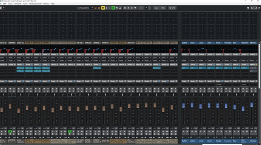
The workflow enhancements with the various nice pop-ups for channel strip, EQ etc. plus the mix channel on the left of the arrangement session is a HUGE improvement. I´m using Cubase´s stock stuff more and more, because the sound is great as thirdparty plugins (and therefore save CPU). they are so damn accessible, click the EQ picture, change pre (pre gain/filters) or EQ settings - click away - gone, click any of the channel strip modules tweak, click away - gone. It's very, very good - all without having to touch the mixconsole.
This version looks like Steinberg have finally listened and tried to make it a more cohesive experience (cough Studio One) rather than tacking on loads of half-implemented new features. You can do so much from the arranger window. Cubase is finally starting to feel like a modern DAW - plus all the immense do-anything power is still there under the covers. Impressed.
I think this is the best Cubase update in sense of workflow enhancements for years.

It's always been that way: people complain with every new design. Changes are not popular in life.
But we'll get used to this new look. Just like in all previous decades with such GUI changes.

I have lots of Vocoder plugins but this new Steinberg one is superb, I love this analog sound. The ability to drag MIDI sequences onto chord pads is genius too. The multiple MIDI channel editing stuff is great. The new compressors and vocal strip fx sound nice. I really like trackversions for video, I've wanted this for a long time!
And if people really compared Cubase vs. Studio One onstock effects and synths (compare their comps, EQs, delays, modulation fx, amps, reverbs, distortions, synths side-by-side), then they would hear that S1 does significantly worse. Cubase is the best-equipped DAW after Logic. C13 comes with a modern sample content with very high quality varief effects and professional synths. It's welcome to continue like this. (Exactly this is this is why Logic is so popular..)

And it´s true, the update from Cubase 12 to Cubase 13 is $99 and the upgrade from Studio One 5 to Studio one 6 is $149. I am happy that Steinberg are skipping the paid .5 upgrades and giving us very good value for money full version upgrades.
 
Last edited:
I always find it interesting the wide spectrum of workflows out there, and therefore how everyone has their own notion of 'Absolutely Essential Feature' - and, if absent, the wild-eyed exasperation of wondering how others are seemingly oblivious to this monumental showstopper! :)

I haven't upgraded from C12 yet, and probably won't for the moment.

Like many, I was hoping Expression maps would get some love.
Like ThomasNL, I was very excited at the belief that Multipart Editing would mean I could finally edit CCs of multiple tracks simultaneously - similarly, I am really disappointed that this is not the case.

But the biggest thing - which, though reported and verified, seems only to be a workflow problem for little old me - is that making the slightest tempo change in the tempo editor or track or anywhere, while having multiple tracks open in Score Editor, still causes huge 15 second freezes!

*Wild-eyed exasperation sends me gyring around my idiotic bedroom studio!*

Och well!
 
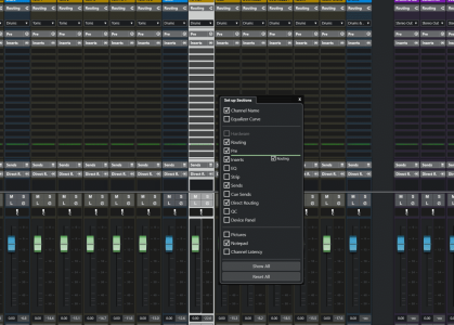
I really like that we have the ability to re-arrange sections now by drag-n-drop. If you right click on one of the tabs (like Sends) it'll give you the option to "Set up sections"

Also found a happy compromise with the channel colours, just have it set really low. Still be nice to adjust those grey bits though...

1699018656150.png
 
I'm literally looking for the picture. Here's why.

In C12 and earlier, there is only one icon at the top of the Inspector, so it's pretty easy to know where to look, in this example next to ch2. The 2nd image is C13.

With C12 there's literally only one option for me to find, that lonely icon - great. When I click it it turns yellow so know it's open.

With C13, there's two icons next to each other, both slate grey in a vast sea of slate grey, much further down the screen than they used to be. The first one is what I need to open the UI. When I click it it turns greyscale white. The second opens the channel settings icon, stealing focus from the midi track I want to the parent instrument track above. That would never get annoying.
I was merely addressing where you said "Nothing there for midi when routed to an instrument.". I was just pointing out that there is still a way to open the instrument.

I'm not arguing that it's better or worse. For me personally, I like the new icon over the old tiny little less obvious icon. I agree that having the color when selected is preferred, but if you have an inspector open, you already know which instrument is open most of the time, right?

Regardless, I was just trying to help and point out that there was still a way.


Speaking of stealing focus, there's another glaring UI error here, as many here have highlighted - the highlight. Look how visually opaque C13's selected track is next to C12. You can barely see the difference in shade. Or how about the input monitoring icon - once distinct and yellow, now greyscale white. I'm very surprised this got through beta testing, anyone with a visual impairment would be screwed.
Well, I addressed the selected track visibility in my post with all the images. I think the only actual issue is the font color, which I'm guessing can be fixed. But I showed you can change the contrast very easily to see which track is selected. I don't see this as an issue outside of the font color, which only matters if you have a light colored track or have the brightness of selected tracks turned up high.

EDIT - just seen your post on the previous page, KoolKeys, on the highlighting problem. This is ridiculous. C12 and earlier was simple - track turns white, fonts turn black. Now it's all a shading mush - just as you say, making the highlight actually visible renders the text unreadable. That's just plain embarrassing.
As I agreed above, the only issue here is the font. If they fix the font color, it becomes a non-issue, correct?

Me personally, I use the last option from my post, with colorized tracks ONLY for selected tracks. I think that makes it super obvious what is selected, and the font color isn't much of an issue.

I am NOT saying the C13 GUI is perfect. It definitely isn't. I like the direction they went, but also think they can dial it back a little in the other direction. I wouldn't mind seeing a little more color. Overall, I prefer C13, which is ONLY personal preference. But I'm totally in agreement that it needs a little more contrast in certain areas.

Brent
 
Top Bottom