What's new

Cubase 13 released! Now available for purchase

@Daniel S. thanks for the info on expression maps.

Do you know if there have been any talks to improve the routing of insert effects?

These days Ableton Live, Bitwig, Studio One, and FL Studio offer a way to create some kind tree branched routing for effects for parallel processing. I think Cubase and Logic are the only DAWs that don't support this type of workflow.

This is a video from Studio One describing the feature in case you're not familiar.


Reaper has got it with latest update- I like the container concept - it is fast and easy. I was surprised this was not included in c13 but hope we will get this in future. This will save lot of time by setting up presets for parallel processing( incl FX) and also the real estate. And yes mix knob on containers would be icing on the cake just like Cockos did.
 
@Daniel S. thanks for the info on expression maps.

Do you know if there have been any talks to improve the routing of insert effects?

These days Ableton Live, Bitwig, Studio One, and FL Studio offer a way to create some kind tree branched routing for effects for parallel processing. I think Cubase and Logic are the only DAWs that don't support this type of workflow.

This is a video from Studio One describing the feature in case you're not familiar.


Waves is controversial obviously, but their free StudioRack plug-in is really nice for parallel chains and supports non-Waves VST3. You can feed it sidechains internally, which is nice if you want to duck a delay or reverb without setting up another set of sends.
 
If we are doing the whole Cubase VS Studio One - For me S1 has always been the king of workflow and getting stuff done with intuitive processes and efficiency (Basically it's really good at getting out of your way). Where Cubase could really learn from S1's ease of use and intuitive way of achieving what you are trying to achieve in the quickest way possible. But Cubase definitely excels in features and depth, because it has been around for longer and some of the new 13 workflow improvements are definitely a much needed addition to Cubase, especially the new MIDI/Piano Editor visibility feature where you can see your events in the editor.

Studio One still can't do the whole VEPro actually large template (and with this I mean actually, ACTUALLY large) thing. Which is indispensible for me in getting the DAW "out of my way".

I still prefer no setup to every slight setup when I am in my zone.

Cubase (or in my case, Nuendo) is in this goldilocks zone of having VEPro setup with something like 3000 midi tracks setup with individual articulations all with their negative track delays set. Click and play, click and play. Pre-mix inside VEPro, a hundred busses return back to Nuendo. It's a beautiful, fast, reliable system.

No other DAW can do this still, as far as I'm aware. And as long as that is, other DAWs (even Reaper) can add as much as they like, but they won't be as fast in my day to day.

I decided lately I never wanna give that workflow up. It's too good (and it's also objectively the fastest out of all).

For complex projects, no other DAW gets out of the way like Cubendo does. And that's pretty "core" to me.
 
Reaper has got it with latest update- I like the container concept - it is fast and easy. I was surprised this was not included in c13 but hope we will get this in future. This will save lot of time by setting up presets for parallel processing( incl FX) and also the real estate. And yes mix knob on containers would be icing on the cake just like Cockos did.

Waves Studiorack. It's free. And good. Very good. Supports third-party. And it's better than any splitter I have yet seen.
 
I had high hopes for the Channel Tab, but it's still meh. In Reaper you have your plugins right in your track view, it's WAY faster.

Steinberg has saved me money once again.

Setting a shortcut to Edit Channel Settings gets you a whole channel strip with EQ, compressors, de-esser, tape emulation, gate, limiter, inserts pre and post fader, pre-section, sends section and a whole host of other goodies in one window.

As far as I know, Reaper can't do that, not even with a script (paid or unpaid).
 
Hmm - Cubase 13 respects my Cubase 12 key commands, but not the color scheme I had for the arrange and other windows. Anybody know of a way to migrate that?

Greatest feature so far is I can use horizontal scroll with my Magic Mouse in the Mixconsole on top of the faders and it doesn't modify the track levels when doing so.
Control + Click exclusive solo is gone on the ride :) this is part of my basic workflow- no beta tester found this defect or I am missing something.
I got my colours back with key command I saved.
 
No one is talking about it but Dom Sigalas showing how to open every plugin from the channel strip into it's own interface from the mixconsole is a fantastic workflow improvement for me!😍

Honestly that new mixer is amazing with rearranging everything. My 4K monitor is happy and so am I.

Plus, is it just me or is that new vocalchain an amazing second type of channel strip that's quite useful on anything, not just vocals? That thing is powerful!
 
Last edited:
MIDI tracks don't have the little instrument icon, but you can still open the instrument under the routing section of the inspector

Cubase 13 released! Now available for purchase

You can change the instrument there, or click the keyboard to open up the instrument that the track is routed to.

The only difference is that there isn't a little picture of the instrument. But exact same functionality.

Is this what you were looking for?

Brent
I'm literally looking for the picture. Here's why.

In C12 and earlier, there is only one icon at the top of the Inspector, so it's pretty easy to know where to look, in this example next to ch2. The 2nd image is C13.
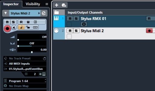
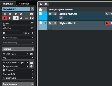
C12.PNG C13.PNG

With C12 there's literally only one option for me to find, that lonely icon - great. When I click it it turns yellow so know it's open.

With C13, there's two icons next to each other, both slate grey in a vast sea of slate grey, much further down the screen than they used to be. The first one is what I need to open the UI. When I click it it turns greyscale white. The second opens the channel settings icon, stealing focus from the midi track I want to the parent instrument track above. That would never get annoying.

Speaking of stealing focus, there's another glaring UI error here, as many here have highlighted - the highlight. Look how visually opaque C13's selected track is next to C12. You can barely see the difference in shade. Or how about the input monitoring icon - once distinct and yellow, now greyscale white. I'm very surprised this got through beta testing, anyone with a visual impairment would be screwed.

Anyway, an image would at least compensate for the visual grey goo and give a nice clear place to click to open the instrument. But with midi tracks it's not available, for no obvious reason. That means for anyone working with multitimbral instruments eg VE Pro, the feature may as well not exist.

There's also new options here I neither want nor understand adding to the visual clutter - what is "Insert Recording", why is it permanently greyed out and why does it take so much much space? There's also a redundant new filter under All Midi Inputs, set to Any. Don't need it.

None of this is the end of the world, I'll probably get used to it in time, but in all ways this new look is a backwards step for me. Uniform slate grey for everything is not a good UX. For the visually impaired alone, some fixes are required.

EDIT - just seen your post on the previous page, KoolKeys, on the highlighting problem. This is ridiculous. C12 and earlier was simple - track turns white, fonts turn black. Now it's all a shading mush - just as you say, making the highlight actually visible renders the text unreadable. That's just plain embarrassing.
 
Last edited:
So it looks like after all, making everything the same colour is bothering some users. It's something that I expected to happen but apparently the more flat GUI the better for majority of users.
I'm not sure about this update. Some features would help me with my workflow but this flat interface where it's impossible to distinguish anything anymore is really bothering me.
I'm sorry but after all the conversations that I heard from GUI designers in my company, current GUI of Cubase would be considered as bad design.
Yeah kind of regretting the update. The contrast before was what helped me use it, but now it is just awful figuring out what is selected and how stuff was moved. I really hope they address this in an update soon
 
So it looks like after all, making everything the same colour is bothering some users. It's something that I expected to happen but apparently the more flat GUI the better for majority of users.
I'm not sure about this update. Some features would help me with my workflow but this flat interface where it's impossible to distinguish anything anymore is really bothering me.
I'm sorry but after all the conversations that I heard from GUI designers in my company, current GUI of Cubase would be considered as bad design.
This, absolutely. Though not sure it's the flatness per se - those controversial fader caps are super-3d-contoured. But the colour palette - inspired presumably by 50 Shades Of Grey - is a UX disaster, no doubt about it.

I'll persevere for a bit longer just in case, but right now I have buyer's remorse and it's likely I'll revert to C12 permanently unless they row back on some of their disastrous choices. Even the headline features like the key editor track visibility seems ho-hum to me - I always work with the key editor on my right-hand screen, project window on the centre, so it's been easy to select multiple clips if I need to.

So far for me the single unambiguous win has been tap tempo in the transport bar. Woot!
 
Studio One still can't do the whole VEPro actually large template (and with this I mean actually, ACTUALLY large) thing. Which is indispensible for me in getting the DAW "out of my way".

I still prefer no setup to every slight setup when I am in my zone.

Cubase (or in my case, Nuendo) is in this goldilocks zone of having VEPro setup with something like 3000 midi tracks setup with individual articulations all with their negative track delays set. Click and play, click and play. Pre-mix inside VEPro, a hundred busses return back to Nuendo. It's a beautiful, fast, reliable system.
Indeed, Studio One is STILL almost unusable for any template having more then a few hundred Vepro instrument tracks. If you have more, then e.g. clicking on "show all tracks" or using "find track" becomes a nightmare.

Also, quiting Studio One 6.5 takes several minutes here (45 Vepro instances, ca 600 tracks). So you need to force kill it.

Cubase is so much faster in this respect, Presonus really should take this seriously.
 
Last edited:
This, absolutely. Though not sure it's the flatness per se - those controversial fader caps are super-3d-contoured. But the colour palette - inspired presumably by 50 Shades Of Grey - is a UX disaster, no doubt about it.

I'll persevere for a bit longer just in case, but right now I have buyer's remorse and it's likely I'll revert to C12 permanently unless they row back on some of their disastrous choices. Even the headline features like the key editor track visibility seems ho-hum to me - I always work with the key editor on my right-hand screen, project window on the centre, so it's been easy to select multiple clips if I need to.

So far for me the single unambiguous win has been tap tempo in the transport bar. Woot!
I think that we can use to it, if certain elements will at least stay in the same place, so we can develop new muscle memory (ignoring eyes in this case).
By flatness I mean flat colour range because I have no better word for it this early morning ;)
But indeed, now this new fader is out of the place completely :)
 
Lots of people have commented that closing projects is better. I think it might be a bit snappier, but it might be deceptive because you just can't see the struggles it is going through any more.

In fact, the Cubase icon disappears completely from the Windows task bar when closing a project, so you think it has crashed - short of looking at Task Manager, you're completely in the dark until, 30 seconds later (on a large project) up it finally pops.

EDIT - oh, one other bit of oddness - top right X to quit Cubase now seems to only close the project. With the icon gone from the taskbar you think you've done it, but eventually it unobtrusively sneaks back again, and the intro screen appears out of sight behind other apps. In other words, easy to not close by mistake.
 
Last edited:
Setting a shortcut to Edit Channel Settings gets you a whole channel strip with EQ, compressors, de-esser, tape emulation, gate, limiter, inserts pre and post fader, pre-section, sends section and a whole host of other goodies in one window.

As far as I know, Reaper can't do that, not even with a script (paid or unpaid).
It's still in a window that I have to click for.
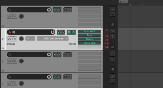
Meanwhile in Reaper, I have every plugin right there in the main view:
Cubase 13 released! Now available for purchase
 
Maan, the vertical zoom in the project and piano editor mouse wheel... wow, man, such a game changer.... Finally we are talking navigation....
I've found learning cubase because of the lack of this feature frustrating. I'm so pleased to see it be added.

Can you change it, to not need ctrl and shift? But just to alt? I know some shortcuts on the mouse are locked out.
 
Top Bottom