What's new

Cubase 13 released! Now available for purchase

Not tried it in anger on a project yet, but two early niggles:

1. While it's great have an image to click in the inspector to open the vst instrument, this only seems to appear on instrument tracks. Nothing there for midi when routed to an instrument.

2. The new mono/stereo convert button doesn't appear in narrow mix view, or in the fader button in the Inspector, or the new channel pane. Unless working with wide faders in the mixer, it's essentially not accessible anywhere.
For 1) - why not assign it to hotkey and use on midi / instrument track? Have done it myself, and it is now part of my muscle memory.
 

Attachments

  • Screenshot 2023-11-03 at 0.57.27.png
    Screenshot 2023-11-03 at 0.57.27.png
    6.2 KB · Views: 39
I usually do not jump on the update.. this is the first time ever I've downloaded the new version right away and put it to the test on a new project..

yes. you are right in your assumption. It crashed.. hard.. all is frozen forever as it seems.. I should ve known beta.. better I mean.. :/
 
@Daniel S. thanks for the info on expression maps.

Do you know if there have been any talks to improve the routing of insert effects?

These days Ableton Live, Bitwig, Studio One, and FL Studio offer a way to create some kind tree branched routing for effects for parallel processing. I think Cubase and Logic are the only DAWs that don't support this type of workflow.

This is a video from Studio One describing the feature in case you're not familiar.

 
For 1) - why not assign it to hotkey and use on midi / instrument track? Have done it myself, and it is now part of my muscle memory.
Thanks Yuri. In general I'm more mouse than keyboard-focused - if I'm using a hotkey it's usually a last resort as the mouse version is too buried / complex. Also the keys don't work on the laptop where the on-screen keyboard is usually open - those keys don't work as shortcuts. That's another thing - I'd love a mode where the on-screen keyboard is just what it says it is, and not mapped to the physical QWERTY keyboard.

But given everything, with this poor implementation it might make sense - the old yellow arrow in the inspector caught the eye quickly, now the universal grey colour scheme has made it anonymous and the picture isn't available on midi tracks, so it's not reliably there in any other way.

For a real improvement it's always amazed me that there's never been an option to automatically open an instrument VST (or bring it the front) when you click a track. That alone would be 10x the productivity value of... oh, say the channel pane.
 
We know this is disappointing for those users who rely on these features, and I can only assure you that we remain committed to expression maps, and that we absolutely plan to work on them in future versions. However, I don't think it's likely there will be any significant improvements to expression maps coming in the Cubase 13 maintenance cycle – though I could be wrong, I think it's best to set your expectations accordingly.
Has the new Orchestral Articulations Profile standard in MIDI 2.0 had any impact on this? Given that MIDI 2.0 will have that new way of handling orchestral articulations, I wondered if the development of fixes/changes for expression maps was being delayed until that is closer to being finalized, as the expression maps will eventually need to work with that standard as well. After all, it wouldn't make sense for Steinberg to redesign expression maps, only to find that the new redesign doesn't quite work with the new MIDI 2.0 Orchestral Articulations Profiles and that it needs a second redesign only a few years later.
 
Hmm - Cubase 13 respects my Cubase 12 key commands, but not the color scheme I had for the arrange and other windows. Anybody know of a way to migrate that?

Greatest feature so far is I can use horizontal scroll with my Magic Mouse in the Mixconsole on top of the faders and it doesn't modify the track levels when doing so.
 
I just noticed that as well. You can find it now in the dropdown transport window "start mode". I had created a shortcut in C12, that does not work in C13
Oh no...I toggle this preference ALL the time!

Is it just that the shortcut doesn't carry over and you have to recreate it, or that a shortcut can't be created at all?

....Apologies if this has already been addressed in the 6 pages I've yet to catch up on...
 
Seems decent so far, had 2 instances of having to force quite because cubase got stuck "unloading project" - a new issue, never saw that in C12.
 
@Daniel S. hate to bother you with this, as I know you're the Dorico lead (brilliant program, btw)...but it's been so difficult to ascertain any concrete information on this topic, I wonder if you might indulge me? The local undo in the key editor feature that vanished between Cubase 10 and 10.5....any insight as to why this was removed and if it has a realistic chance of returning? Many of us have been petitioning for its return for years now. Greg Ondo has told me he brought it to the developers' attention at one point over a year ago and that they weren't even aware it was gone and were "looking into" possibly bringing it back. Apparently several testers were also petitioning to bring it back for V13.

Obviously I realize not every feature request makes the cut for each version, but this was a critical feature for many of us that we DID have at one point, but lost about 5 years ago. Is it actually being considered for a return, or has it pretty much been tabled indefinitely? Any info you would provide would be very much appreciated.
 
like the little things, like start modes, range tool in key-drum editor and more.
the new UI, seems little odd, maybe need some time to used to it.
hoped a new feature got in cubase 13, Tabbed insert window with option to follow track selection, its a chase to open and close plugin GUI all the time !
my index finger got "schwarzenegger" mode with so much clicking
 
Good grief, I had to take the day off of work and spent hours sanding the ceiling in our master bedroom after doing joint compound to fix a bad contractor "upgrade", and I missed all of the fun! Now there's pages of all of the "constructive feedback" to have to go through, lol!

Maybe I'll just upgrade and install blindly, and see what blows up before I read anything. That sounds like fun. I'm too sore and stiff to get out of my chair anyway.
 
Last edited:
I think I might be the outlier here but I actually really love the new UI and channel tab! Feels a lot more modern to me, and I like how the channel tab feels more streamlined than the inspector which I'm now going to keep hidden most of the time. I use notepad and track versions every now and again, but I access my strip, inserts, and sends hundreds of times a day, so for someone like me this looks a lot better and easier to navigate. When I need the inspector or visibility tab it's just one key command away.
 
Not tried it in anger on a project yet, but two early niggles:

1. While it's great have an image to click in the inspector to open the vst instrument, this only seems to appear on instrument tracks. Nothing there for midi when routed to an instrument.

But given everything, with this poor implementation it might make sense - the old yellow arrow in the inspector caught the eye quickly, now the universal grey colour scheme has made it anonymous and the picture isn't available on midi tracks, so it's not reliably there in any other way.
MIDI tracks don't have the little instrument icon, but you can still open the instrument under the routing section of the inspector

instrumentbutton.PNG

You can change the instrument there, or click the keyboard to open up the instrument that the track is routed to.

The only difference is that there isn't a little picture of the instrument. But exact same functionality.

Is this what you were looking for?

Brent
 
I think I might be the outlier here but I actually really love the new UI and channel tab! Feels a lot more modern to me, and I like how the channel tab feels more streamlined than the inspector which I'm now going to keep hidden most of the time. I use notepad and track versions every now and again, but I access my strip, inserts, and sends hundreds of times a day, so for someone like me this looks a lot better and easier to navigate. When I need the inspector or visibility tab it's just one key command away.
You're not alone. I really like the changes too. It isn't perfect, but a vast improvement on previous versions (which I already liked). A lot of little workflow improvements here that were worth the upgrade.

Heck......vertical zoom alone would have gotten me to upgrade. I can't tell you how much I've wanted that.

Brent
 
Steinberg is my favourite VST company. Cubase is the best software investment i have ever made.

Thank you Steinberg for creating these fantastic tools at affordable prices. If you stay away from the subscription model, you have a customer for life. Even my mom loves you guys. Keep up the amazing work!
 
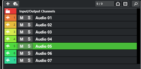
Visually, I don't feel the gui redesign is an improvement. For me, track selection is more difficult to see what is selected, especially when the tracks are minimal height. I prefer C12 simple white highlight with black font when selecting a track.
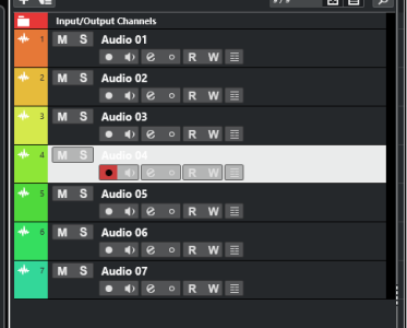
You can make the selected track essentially white. but the problem is that the text is also white (the image below isn't as bright as it can be, you can make it "whiter":

trackbackground1.PNG

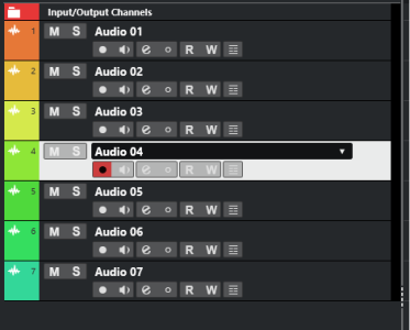
Of course, if you mouse over the track, you can see the text better:

trackbackground2.PNG

So maybe they can make a text color setting in preferences.

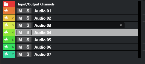
You CAN make it not quite as 'bright' so that the text is still more visible:

trackbackground3.PNG

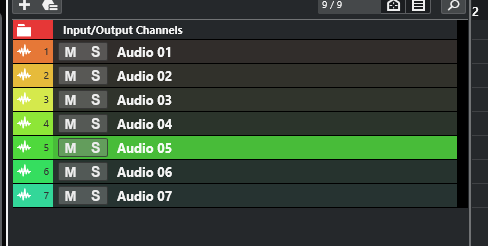
You can go a little darker still to increase the contrast. Or, if you colorize your tracks, you can adjust it so that selected tracks show brighter colors, making it obvious which is selected as well:

trackbackground4.PNG

You can even turn off the colorizing for tracks EXCEPT when selected, if you like the tracks staying default colors, but want them more visible on selection:

trackbackground5.PNG

I realize it would be nice to have the text darker on selection, so maybe they can add this preference. But just posting so it's clear that you CAN change the selected track brightness or tweak the settings to make it more obvious which track is selected.

Brent
 
Top Bottom